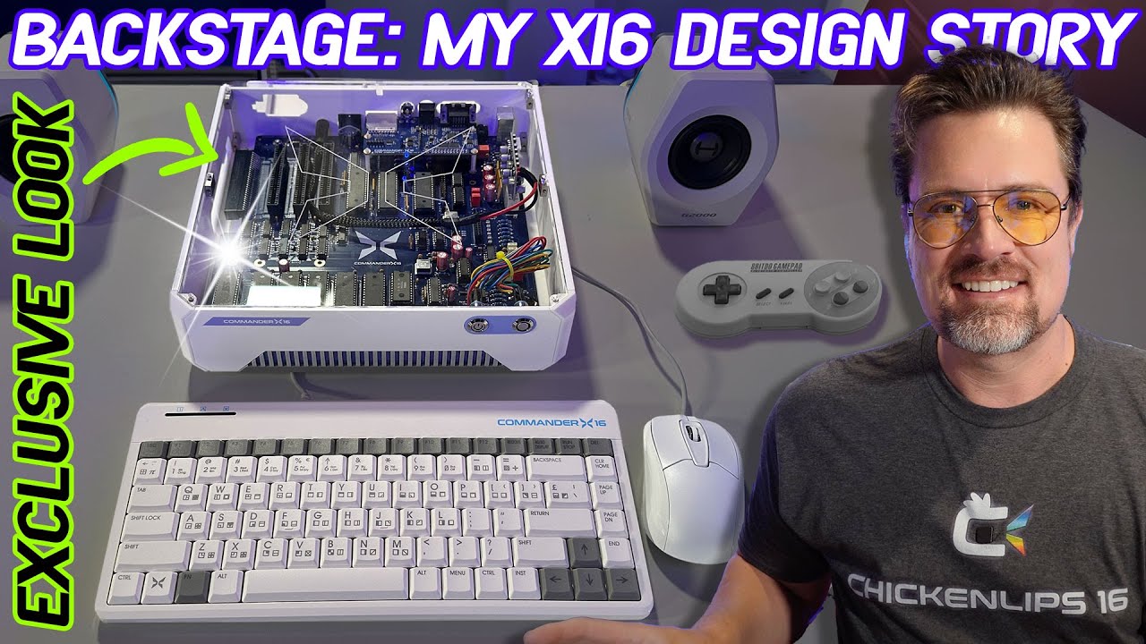
To me the official case isn't attractive, the front face look like an unhappy robot. Overall feeling is also cheap plastic box which I can understand when combined with the existing keyboard, but then the price doesn't match. I also find it odd that the case uses a very different blue than the keyboard logo, creating a mismatch between the two. It is more like IBM Aptiva purple:

- Late 90s IBM Aptiva tower case
- aptiva1.jpg (142.36 KiB) Viewed 5153 times
But it is great that we of course do have the option to use anything else that we get our hands on!
Continuing in the topic of disagreeing I'm also not a fan of the X ending up into the name, and I guess I have some extra negative into that after what happened to Twitter. That of course happened after the name had been decided, but the X didn't feel great to me even before that.
As a random thought I wonder if we could call the 16-bit processor upgraded machines "Super Commander 16" since then the machine would be using Super Nintendo gamepads
and processor

Regardless it has been a lot of hard work by a rather small team and it is great to see things working, growing, and being available. It is easy to disagree on what things look and feel like, and very hard to get that part right. To adjust things for myself I'm considering designing an alternate logo to use.

